Yesterday, at Solar Media’s The Future of Energy meeting in London, I delivered a presentation on what a low-subsidy solar PV market might look like in 2016 and 2017. A new model was developed to illustrate this, with the results inadvertently giving a glimpse into what the UK solar industry might have looked like also had the market not been characterised by major boom-and-bust cycles.
The title and scope was ‘Opportunities in the UK solar sector for 2016-2017’. Anyone tracking the government’s proposed changes to the solar industry in the UK in recent months will know that doing this with accuracy is impossible. Especially since we are still waiting – albeit maybe at the eleventh hour – for the reset to all FiT and ROC rates to take effect early 2016.
So instead of doing the market-researcher default cop-out of having a very low downside and a very high upside (to allow for any actual value to fall somewhere in between!), I decided to tackle the question in a very different way.
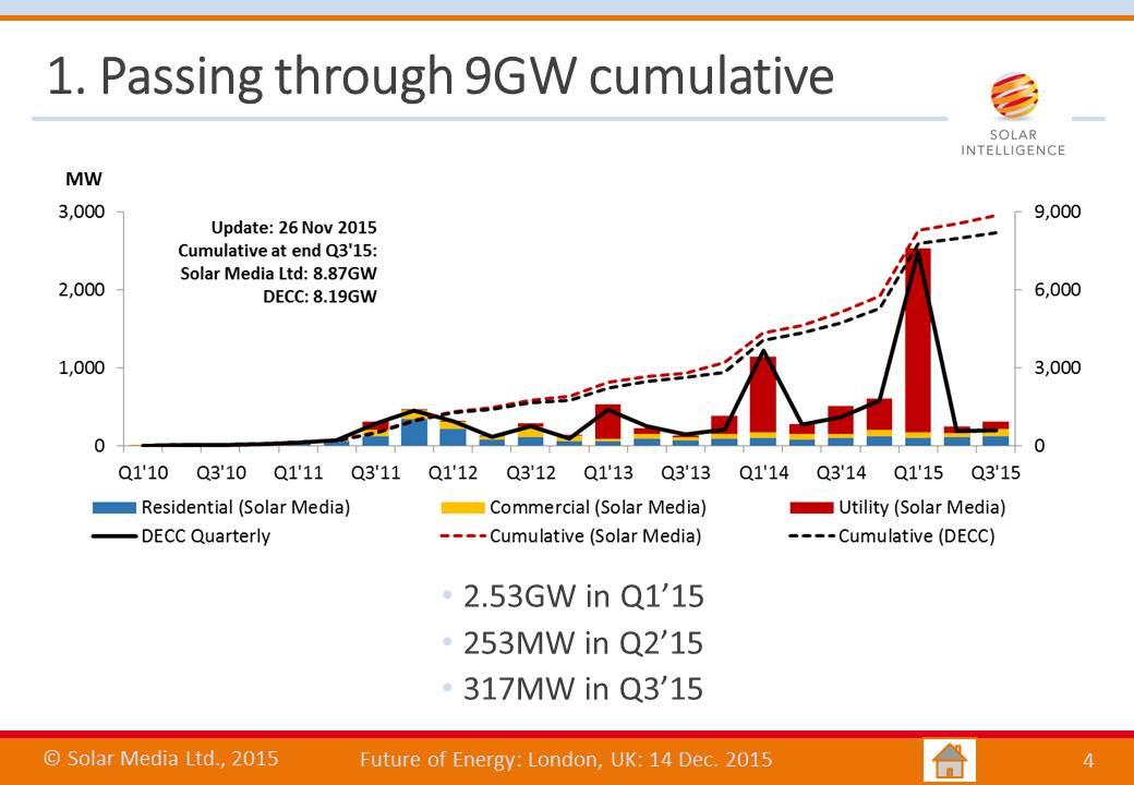
The starting point was to look at actual solar PV deployment so far in the UK, up to the point where the industry passed through the 9GW cumulative figure during October 2015. This is shown below.
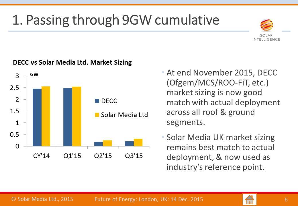
And to do a comparison with the government’s official statistics, the slide below compares Solar Media’s market research figures with the current data from the government for the whole of 2014 and the first 3 quarters of 2015.
The next step involved looking at the highs and lows of the past few years, and making the assumption that the spikes are largely artificial and therefore not indicative of any low-subsidy (or even zero subsidy) climate.
The slide below shows the actual quarterly deployment (top graphic) with the FiT and ROC driven peaks being well above other quarterly averages. Going through every quarter, and removing the artificial highs, we end up with the lower graphic. This is where the interesting discussion kicked in yesterday.
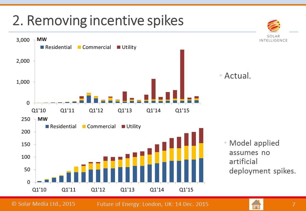
The lower graphic in the slide above is probably what the government (and most of the UK based solar players) would rather have seen happen. It is what a well-managed solar policy could have looked like from DECC, and possibly even one that could have unfolded if caps could have been placed on market deployment.
While largely theoretical (because simply it didn’t actually happen), this type of analysis is however a good starting point for the next phase of the UK solar industry, assuming that subsidies are cut to much lower levels (the low subsidy, or even zero subsidy, environment). Looking at the trends across the different residential, commercial and utility segments is potentially of great value going forward.
Applying basic trend analysis and imposing a seasonality envelope that has summer deployment greater than winter months, and moving out to 2016 and 2017, we now start to get something that is perhaps a better indication of what the UK may look like going forward.
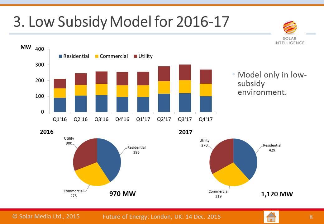
The model would therefore result in figures just below and above the 1GW mark, for 2016 and 2017, respectively, with the residential market the strongest.
While definitely not a real market forecast, owing to simply not knowing yet what the incentives for FiTs and ROCs will be during 2016 and 2017, the idea of a low-subsidy UK solar market restarting at the GW level and having steady and predicable growth out to 2020 is something that most stakeholders – politicians down to installers – would probably be happy with.
In reality of course, 2016 will likely be above the GW level, and 2017 possibly below this mark, with the reset phase possibly being a two year process. However, if the analysis above is then used to forecast out possible deployment during 2018 to 2020, then an annual market of 1-1.5GW during this time period unfolds. And then perhaps only does the true fun begin!